#1 More concerted, aggressive, and consistent economic policy action.
#2 Business management more oriented to creating shareholder value.
#3 Differences in the sectoral composition of indexes.
#4 Differences in index concentration.
In Part I of this post, we saw that:
– In the last 100 years, the equity markets of the various developed countries have had different average annual returns, but with little deviations, except in the periods and for the countries most impacted in the two great world wars.
– Markets evolve in cycles, alternating periods of higher performance between the US and the Rest of the World.
– Since the Great Financial Crises, the performance of the US equity markets has been much higher than that of the other developed countries.
The following questions we will address in this second part:
What is behind this overperformance? Is this recent US equity market overperformance against the Rest of the World – Europe and Asia in particular – about to last or, on the contrary, can a reversal to the mean be expected?
In this post we will see that this situation has parallel in the earnings evolution of US companies compared to their counterparts from other countries and regions, in particular Europe.
US companies have shown themselves to be more profitable and created more value for shareholders through more effective cost management and more efficient earnings growth.
They also benefited from economic, monetary, and fiscal policies that are more growth friendly.
In addition, the US equity market has a composition and concentration at the sectoral and individual level of its constituent companies that accentuate this bias, due to the greater weight of the technology sector and some of these companies with the largest capitalization in the world.
When the differences are analysed, it is difficult to conclude that the US market is more expensive or vulnerable than the other ones, particularly the European market.
Thus, in the near future, a cycle reversal or reversal to the mean is not expected, but rather a greater synchrony between the various regional markets.
Brief reminder: In the last 40 years there has been a pattern of reversal of performance cycles between the US and the Rest of the World stock markets, but there has been a US take-off in the last 10 years.
We begin by briefly reminding the performance cycles of the equity markets in recent decades.
Over the past 40 years, the US and the Rest of the World have had cycles in which they have alternated performance leadership:

The Rest of the World dominates in the 80s, the US in the 90s until the technological crisis, then back to the Rest of the World until the Great Financial Crisis and after this crisis and to date it has been the US.
The following chart shows the relative performance of the US equity markets compared to the Rest of the World over the past 50 years, highlighting well the strong relative performance of the recent US cycle associated with the FAANG boom:
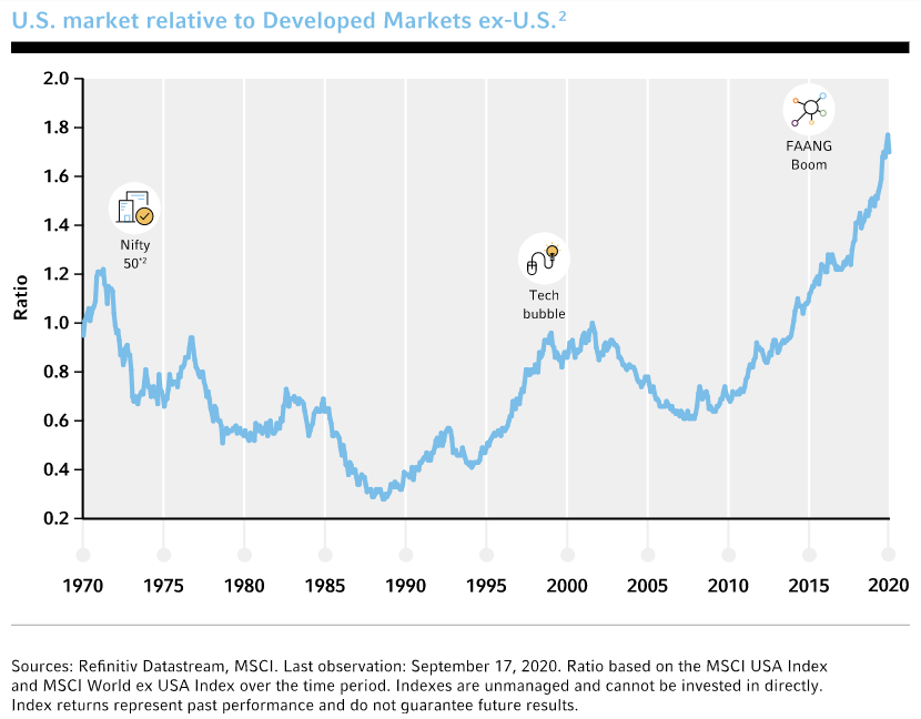
From 1970 to 1990, the US performed worse mainly due to the exceptional appreciation of the Asian continent, notably Japan, Asian tigers, China, and India.
Between 1990 and 2000, the situation reversed with Japan’s decline and the growth of the first wave of information technology companies. This phase culminated precisely in the dot.com, which was responsible for the worst performance in the US until the end of the Great Financial Crisis in 2008.
As of 2009, the US has shown unstoppable superior performance.
The first question that arises is what was behind these cycles, in particular differences in the growth of company earnings or market valuation patterns and metrics.
The best performance of the US against Europe and the Rest of the World in this cycle was fundamentally driven or translated by differences in earnings growth.
Much of the explanation of this different performance lies in differences in the evolution of companies’ earnings.
In the following chart we have the evolution of the earnings per share of the companies of the main indices of the North American and European stock markets, namely the S&P 500 and the Eurostoxx 50, from 2009 to 2019:
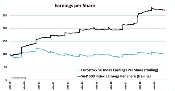
We see that in this period the earnings per share of companies grew 150% in the US while they remained flat in Europe.
If we extend the period of analysis, we can conclude that this parallel has never been clearer than in this cycle.
In the following chart we have the evolution of the growth of the results of companies since 1994:
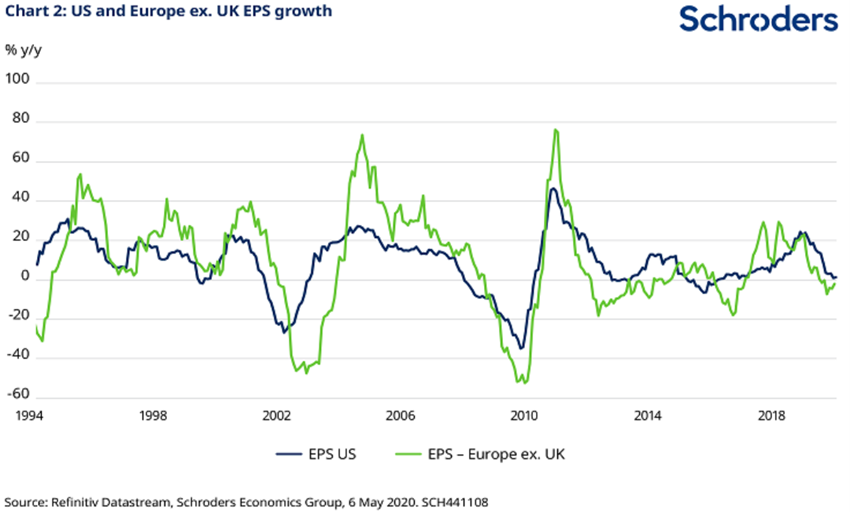
We also see that since 2009 the earnings per share of US companies have grown more than the European ones. The 2000-2007 cycle was more Europe, but with a period between 2002 and 2004 when US companies were better off. In the previous period, Europe was also better.
But there are also significant differences in market valuations, putting the US to higher levels than the Rest of the World.
However, in this cycle, along with the differences in the earnings growth, the differences in valuation were also accentuated.
The following graph shows the evolution of the price-to-book ratio of the S&P 500 constituents versus the Rest of the World between 1995 and 2017:
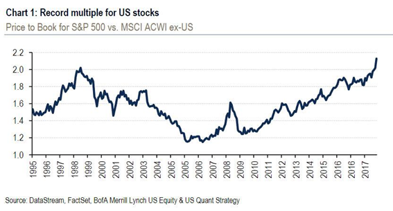
Since 2009, this multiple valuation ratio between the US and Rest of the World index has risen from 1.2 to more than 2, i.e., increased 66.7%.
The following chart shows the evolution of the Schiller CAPE (Cycle Adjusted Price Earnings) ratios for the USA and Europe between 1985 and 2019:
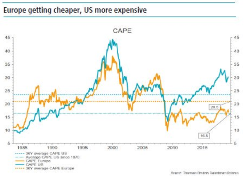
We also see that since 2009 the CAPE of the USA has risen from 15x to 30x, that is, doubled, while that of Europe rose from 10x to 15x, that is, 50% or only half.
The following table shows the position in terms of the most used valuation multiples in the main countries or regions, as of September 30, 2020, compared to the average of the last 15 years:
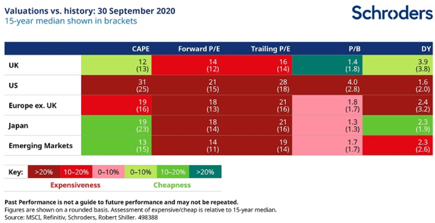
According to these data, almost all equity markets are trading well above historical average values, except for Japan and Emerging Markets, and this situation is more pronounced in the US.
This most historically demanding valuation situation in almost all countries is because we live in a context of very low interest rates, which lower the risk premium required by investors, and the companies’ earnings are depressed by the effect of the pandemic.
The US most demanding valuation against the other markets could also be justified by the best prospects for economic growth and business outcomes.
However, the following graph shows a warning sign regarding the valuation of the US stock market:
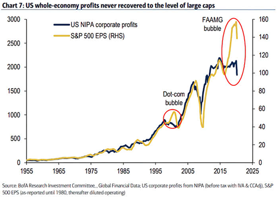
Overall, corporate profitability and the S&P 500 index have shown a synchronized evolution since 1955. However, from 2017 onwards there is a gap, associated with the strong appreciation of FAAMG.
The best earnings evolution and the most demanding valuation resulted from 4 sets of factors: the action of economic policies, the performance of managers, the sectoral composition of the indices and the concentration of indexes.
4 Explanatory factors for the highest earnings growth and more demanding valuations in the US compared to the Rest of the World.
#1 More concerted, aggressive, and consistent economic policy action.
In response to the Great Financial Crisis, all countries in the world adopted virtually the same receipt, expansionary policies, monetary and fiscal, the former of which were based on lower interest rates and asset purchase programs.
We start by looking at the following chart the evolution of official interest rates, those of central banks since 2007:
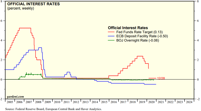
The US Central Bank, the FED, was the first to act in early 2008, bringing the official rate to near zero levels and maintaining it until they ensured economic stability at the end of 2015. The central banks of Europe and Japan did so only a year later and in 2014 they even introduced negative interest rates that are still going on today. These negative rates induce distortions in economies and markets, allowing the prolongation of the existence of companies in financial trouble, distressed or even in zombie mode.
In the chart below we have the evolution of monetary expansion programs in the main regions of the world since 2007:
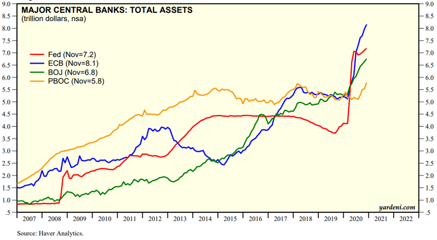
Immediately in response to the Great Financial Crisis, from 2008 on, the US adopted very aggressive monetary expansion policies, known as Quantitative Easing programs, to provide liquidity to the economy and stimulate growth. In total there were 3 programs in 2008, 2011 and 2013, and more recently a fourth, associated with the crisis.
At an early stage, Europe even reacted like the US, but abandoned and even retracted these programmes with the emergence of the sovereign debt crisis in 2011, only resuming it in 2015. China also acted promptly, but only until 2015. Japan had a more gradual and prolonged performance.
As for the performance of fiscal policy, the following graph shows the evolution of budget deficits (on the right) and government debt ratios (left) between 2007 and 2019:
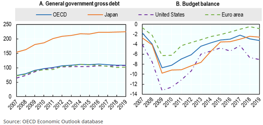
The US has maintained sharper deficits than other regions since the beginning. The Eurozone was much less aggressive, and Japan was acting midway through.
The Eurozone has even performed inconsistently:
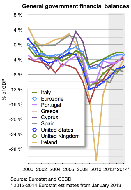
In the face of the rise of the sovereign debt crisis, the Eurozone has demanded the implementation of austerity measures for all countries and those most vulnerable and under financial assistance between 2011 and 2014, as can be seen from the evolution of deficits in the countries of Southern Europe and Ireland.
#2 Business management more oriented to creating shareholder value.
Secondly, US companies have adopted strategies that are more favourable to creating shareholder value than European ones.
US companies quickly developed strong cost reduction programmes in the hardest-hit sectors, such as finance and the autos, which only later happened in Europe.
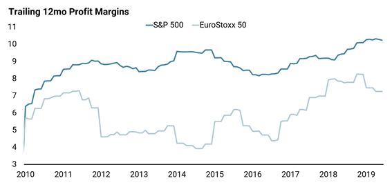
In addition, US managers pursued intense programs of shares buy-backs, fiscally more efficient than the distribution of dividends, which is not yet a European tradition.
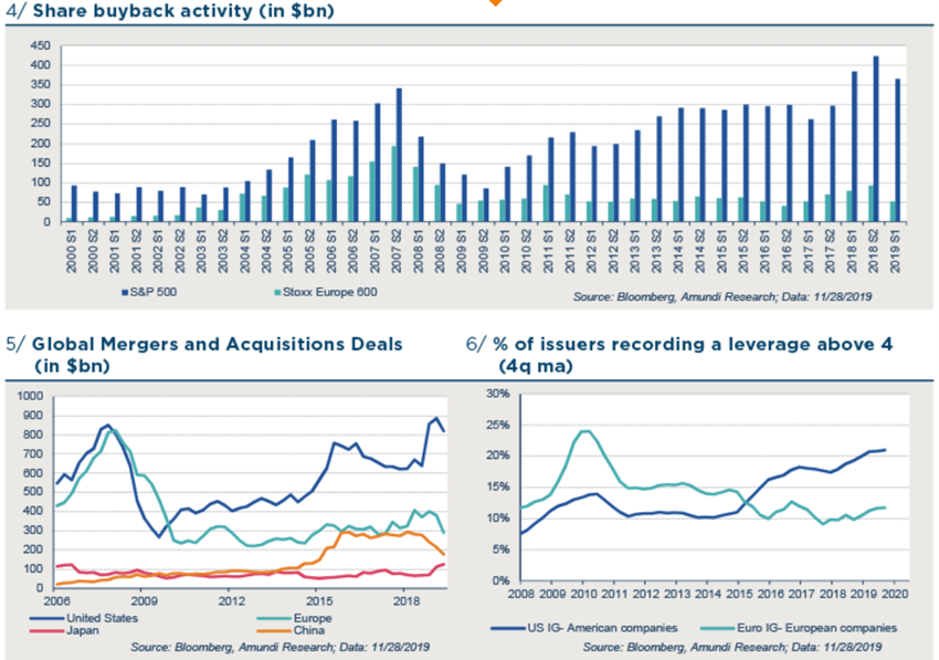
These own stock purchase programs, as well as strong M&A activity, were carried out by increasing the financial leverage of companies in a context of low interest rates.
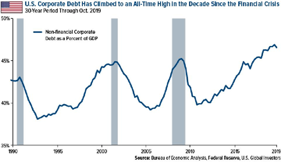
#3 Differences in the sectoral composition of indexes.
Third, the performance also reflects a different sectoral composition of geographic equity markets.
In the following table we have the sectoral composition of the US and European MSCI indices and the effect they had on performance between 2009 and 2019:
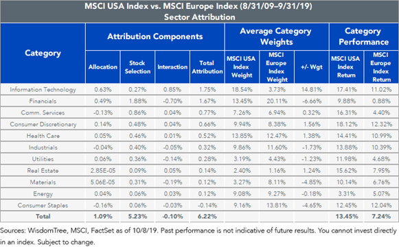
The US index has a higher weight of sectors that had a better relative performance and vice-versa, with the most expressive cases being the information technology sectors (+14.8%), the financial (-6.7%) and raw materials (-4.9%). In addition, the performance of these sectors was better in the US than in Europe.
#4 Differences in index concentration.
Fourthly and finally, the different performance was aggravated by the higher degree of concentration and the effect of mega capitalizations of companies in thriving sectors in the US:
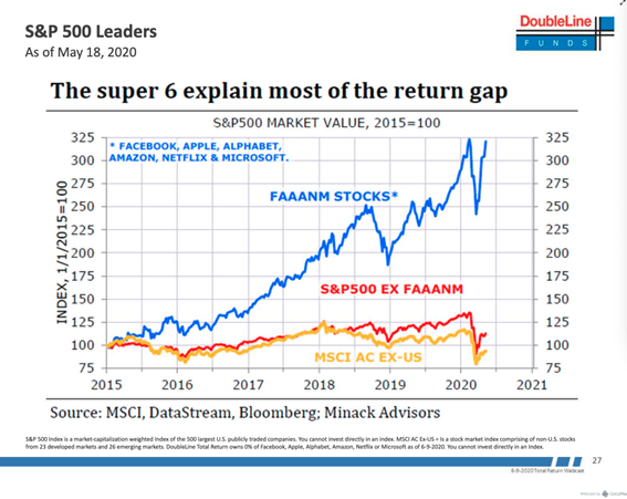
Between 2015 and 2020, the S&P 500 index without FAAANM stocks (Facebook, Apple, Alphabet or Google, Amazon, Netflix, and Microsoft) had a valuation difference of just 25% from the Rest of the World’s ex-US MSCI ACWI index. The big difference was the appreciation of FAAANM stocks and their 225% rise impact on the index in that period (these stocks weigh more than 25%).
In conclusion, the better performance of the US against the Rest of the World resulted fundamentally from better earnings performance of the companies but was also accompanied by more demanding valuations.
The 4 factors that most contributed to this situation were better economic policy management (avoiding the zigzag of sovereign debt problems in Europe and the economic slowdown in emerging countries), more aggressive business management, and the boom of FAANG and other major, US based technology companies worldwide.
The question is whether this gap is justified and sustainable, or whether we will have a correction as it happened in the technology bubble.
Only the future will provide an answer with certainty to this question.
However, our view is that there is no prospect of a significant reversal of the cycle of stock markets between the US and the Rest of the World in the short term.
Instead, we think that markets will perform positively in all regions of the world, US, Europe, Asia and Australia.
The higher multiples may be justified by risk premiums and low interest rates and earnings depressed by the crisis. The recovery in economic growth and economic policies are very favourable. FAAMG is not an epiphenomenon, but rather a reality that is about to stand, factoring in already the risk of greater technological regulation or RegTech.
https://www.credit-suisse.com/about-us/en/reports-research/studies-publications.html
https://www.amazon.com/Stocks-Long-Run-Definitive-Investment/dp/0071800514


