The financial markets history (also) repeats itself and 90 years are information of incalculable value. Not using it is a big disaster for our pockets
Data on the historical performance financial markets have an incalculable value
History repeats itself, with advances and setbacks, civilizational progresses and reversals
And stock markets show that they progress at a good profitability pace in medium to long term periods
Data on the financial markets historical performance has an incalculable value
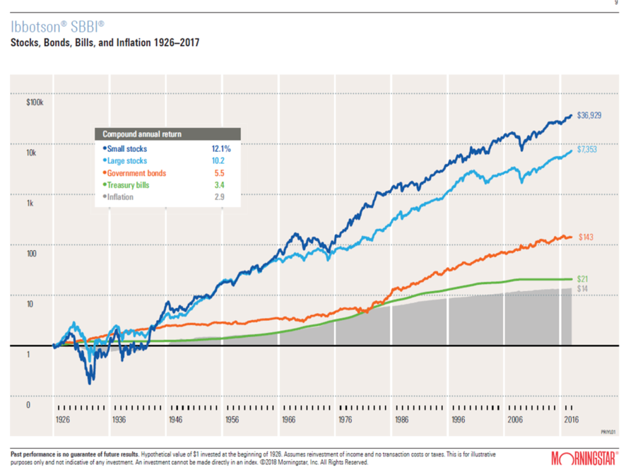
Robert Schiller, Roger Ibbotson and Dimon, Marsh and Staunton built a 90-year-old puzzle of financial history of price evolution of major US and global assets, from small and medium-sized companies stocks and large companies stocks to 10-year Treasury bonds and 3-months Treasury Bills, and inflation rates
The results of Ibbotson’s work (such as Schiller’s) to the US are updated every year being the latest graphic version the following:
The other authors have made a compilation of equivalent data for other countries in the last 117 years, which is also updated annually:
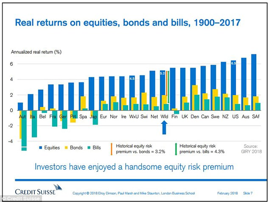
This data has an incalculable value that we should use. We can’t agree more with Schiller’s statement: ” It amazes me how people are often more willing to act based on little or no data than to use data that is a challenge to assemble”.
https://www.credit-suisse.com/about-us/en/reports-research/studies-publications.html
History repeats itself, with advances and setbacks, civilizational progresses and reversals
It is never too much to highlight the importance and value of those works for decision-making. Simply because history tends to repeat itself.
When we say this, the majority accepts but there is always a minority that reacts by challenging it. Generally, saying that from here on the rates of return will be much smaller and the risks much greater. Their position lies mostly in the recent past of the 2007-2008 crisis (forgetting the years that followed) or the dark future of population aging and the lower employability resulting from advances in robotics and artificial intelligence.
No one can guarantee the statement that history repeats itself with a degree a 100% certainty. But we can be almost sure of it.
When we come across these situations, we remember the richness and variety of events in this periods’ history, some good and some bad.
The following chart compiles the results of a survey conducted in 2002 in the Netherlands on the main events of the last century that marked the history represented in the above charts:
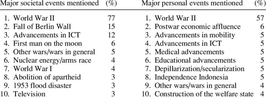
Source: Reminescenses of na Extreme Century: Intergenerational issues in time heuristics: Dutch people collective memories of the 20th century, Peter Ester, Henk Vinken Isabelle Diepstraten, 2002
In these 90 years, we have had a great depression, a great financial crisis, two major wars, moon landing, the technological revolution (advances in information, communications and technology), etc.
We have also had major personal developments in terms of education, medicine, the creation of personal wealth, improvement of life expectancy and of the science quality, etc.
Warren Buffett has a similar position to the US: “In the 20th century, the United States endured two world wars and other traumatic and expensive military conflicts; a depression; a dozen financial recessions and panics; oil shocks; an epidemic of influenza; and the resignation of a disgraced president. However, the Dow rose from 66 to 11,497 points.” (added: now it’s in the 30,000 points range)
And the stock markets show that they provide very good rates of return in the medium and long term
Financial history can be better understood if we show the asset price evolution charts alongside the main events:
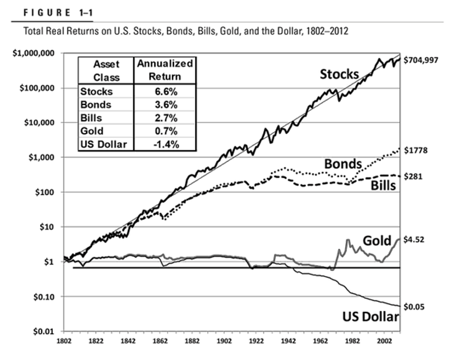
This first graph by Jeremy Siegel, published in his book Stocks for the Long Run, in 2014, shows that the market always growths in the medium to long term despite having occasional downside movements.
It has grown at geometric rates of return from the American stock market of 6.6% per year between 1802 and 2002, also known as Siegel’s constant.
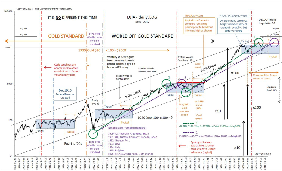
This second chart shows the evolution of the Dow Jones Industrial Average index between 1896 and 2012.
In the first fifty years the market did not advance much, but from the end of wars and the abandonment of the standard, the geometric annual rate of return was 5%.
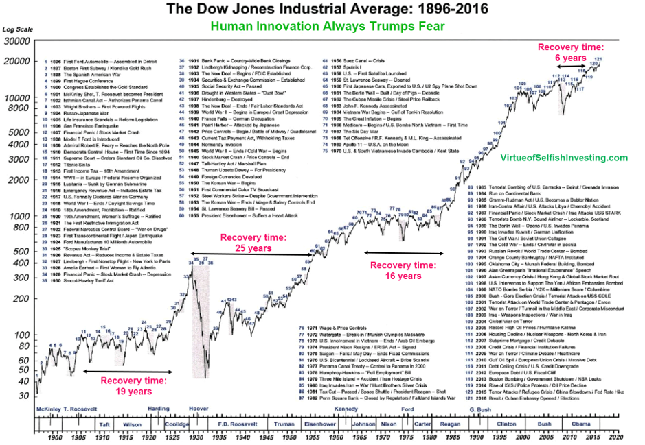
This third chart presents the same index for the same period accompanied by the chronology of the main events.
It shows that the market has moved upwards from 40 to nearly 30,000 points in this more than 100 year period despite the fact that there were times of pause and recovery caused by the around the Depression and after the end of World War II which take time to be recovered.
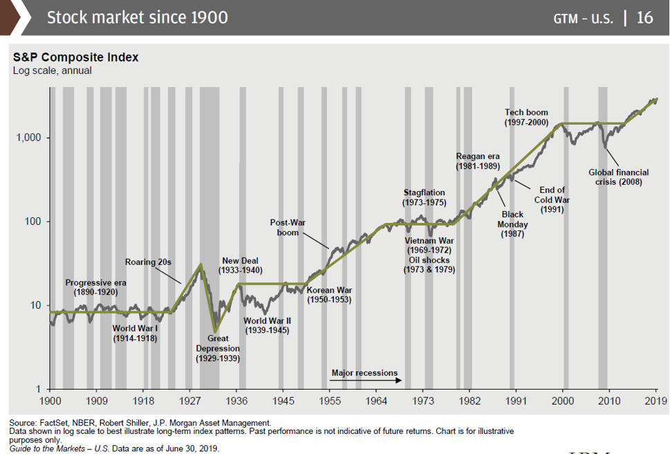
This fourth and final chart is the latest and highlights the most relevant historical positive and negative facts, as well as periods of economic growth and recession, showing that the latter have been less and less frequent as time progress.
https://investorpolis.com/investindo-em-acoes-no-longo-prazo-jeremy-siegel/
https://investorpolis.com/pt-a-random-walk-down-wall-street/
The truth is that regardless of the positive and negative events, which marked this period, stocks and bonds registered those gains.
The main conclusion is that ignoring this data from the past can be is harmful for your investments because we believe this data will tend to repeat itself in the future.


